UX Case Study · Fintech concept
Flow. In-place spending reserves inside a single bank account
Product design · Fintech UX · Prototyping · Content design
Problem
Normal bank accounts show one balance even when most of it is already spoken for, while separate savings pots add friction and strand money away from everyday spending.
Role
Product designer, end to end
Team & timeline
Self-directed concept
60 screens · 12 flows
Tools
Figma, Prototyping
Outcome
A unified banking experience built around one rule: change what people see, not what they are allowed to do.
Change what people see. Not what they are allowed to do.
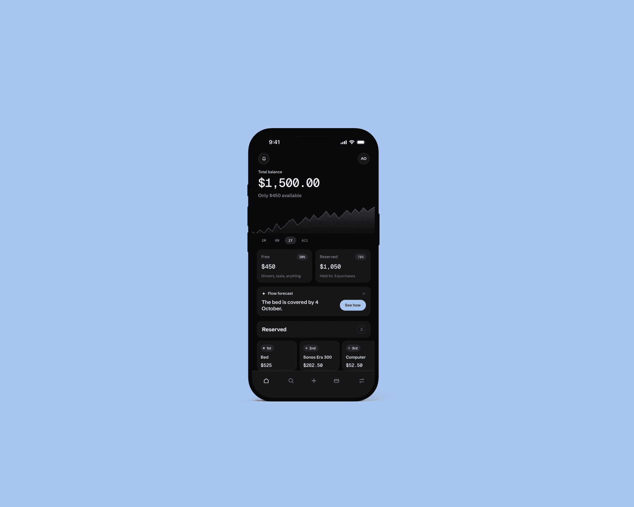
A normal account shows one balance even when most of it is already spoken for, so money meant for a bed quietly leaves as dinners out. The usual fix is a savings pot per goal, but almost nobody keeps that up and it strands money away from where people actually spend. Instead of moving money into pots, Flow labels it in place: one account, one balance, with a layer on top showing what each part is for. Reserved money is never locked, betting that most overspending is forgetting, not defiance.
- Available balance everywhere. Your free-to-spend amount sits as a permanent second line under the total balance across home, card, transaction detail, and payment review.
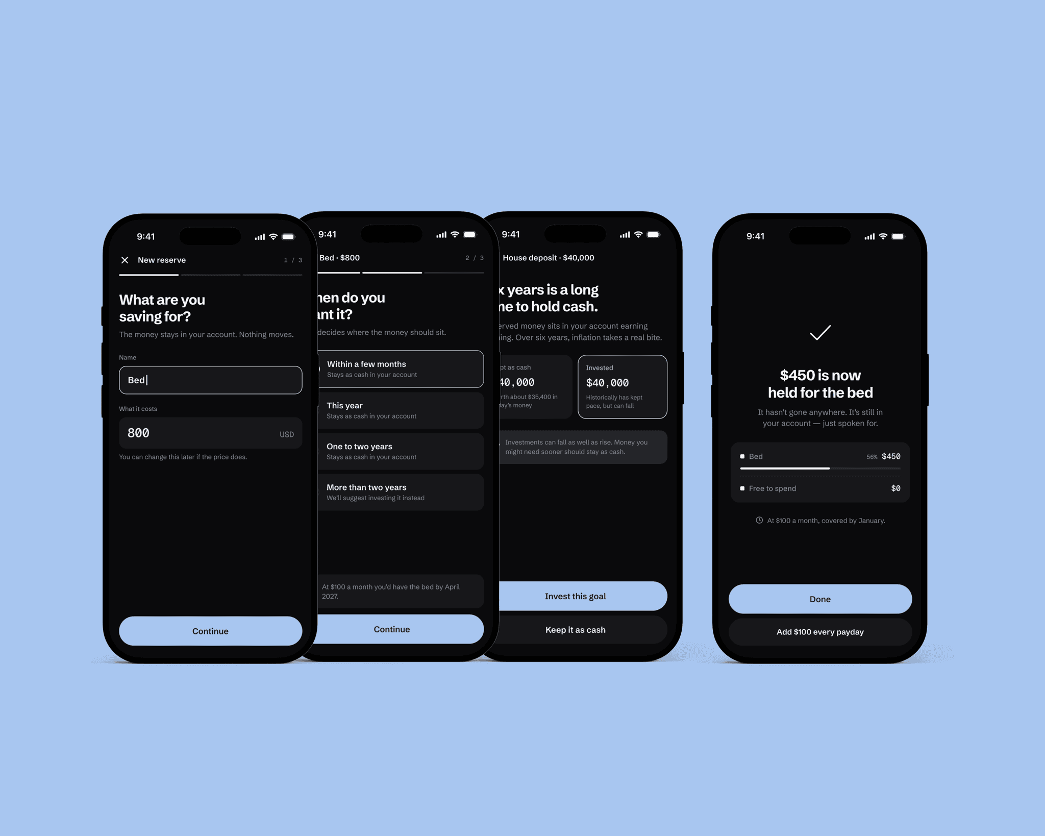
- Horizon-aware goal guidance. Asking when a purchase is needed keeps short-term reserves in cash while surfacing investing trade-offs for multi-year goals like a house deposit.
- In-place labelling over separate pots. Because money never leaves the everyday account, users never have to transfer funds back before making a payment.
Designing for when free money runs out. Plain language and real choices instead of disabled buttons.
A reminder is only useful if it reaches you at the right moment, and the real work sits in the handful of moments where a reminder-based system quietly stops working. Rather than blocking payments or greying out actions, Flow speaks in plain language and puts explicit trade-offs up front so users decide with full information.
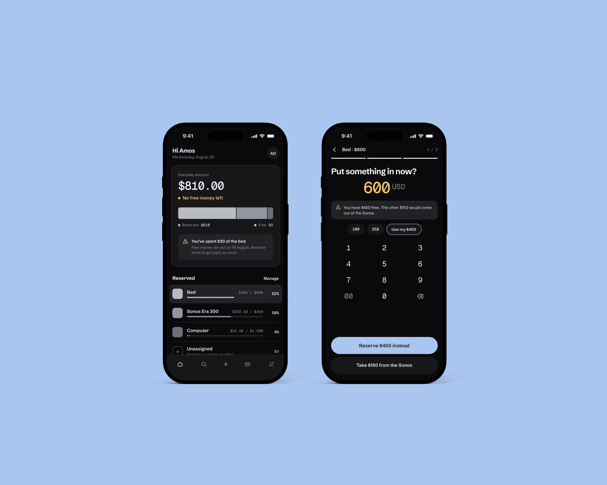
- Honest overspend recovery. The payment always goes through, then Flow names exactly what happened: "Free money ran out, so $30 came from the bed", with one tap to put it back.
- Real choices over dead states. When reserving more than the free balance, the primary action is never disabled; Flow states the shortfall and offers two clear paths with consequences shown upfront.
- Human cards over spreadsheet rows. Redesigned progress-bar lists into compact cards led by the dollar amount, a hairline of progress, and an edge-clipped third card hinting at horizontal scroll instead of a "See all" link.
Moving your own money is not a payment. Why deliberate restraint kept the concept sharp.
Every unnecessary interruption spends the trust that makes reminders work, so Flow follows one strict rule for friction: reserving and restoring happen instantly with no confirmation because nothing left the account, while paying someone new asks for approval and explains why. Failure states stay honest too: if a request times out, the screen states plainly that nothing was sent and the balance is unchanged.
- Asymmetric friction. Instant execution when organising your own reserves; explicit confirmation and rationale only when money leaves to a new payee.
- Plain-language failure states. Timeouts and errors avoid vague warnings and explicitly confirm whether money moved and that the balance stayed intact.
- What was intentionally cut. Excluded share trading, scored risk summaries, spending categories, and streaks or badges so nothing diluted the single idea Flow exists to prove.